Before I ever held a camera for money, I spent years standing in front of an easel, deciding what colour to put next to what.
That habit never went away, and it turns out it's the most useful thing I can give you before a session. Clothes make up a huge share of every family photograph. They decide whether the picture feels calm or chaotic, warm or cold, "us" or "us in costume." And the rules for getting them right are the same rules painters have used for four hundred years.
So here's how I'd dress a family if I were painting them.
Start with one idea: a palette, not an outfit
The mistake almost everyone makes is choosing outfits one person at a time. Dad picks a shirt, the kids get whatever's clean, Mom plans her dress last, and on the day the frame has seven colours fighting each other.
Painters work the other way round. They choose a palette first, a small set of colours that belong together, and then everything in the picture comes from it.
For your family, that means:
- Two or three main colours you all share between you
- One neutral to hold them together (cream, oatmeal, soft grey, denim)
- Nobody matching. Coordinate, don't copy.
Look at the classic Dutch portraits and you'll see it: Vermeer's women wear ochre yellow, deep blue and white, and the whole room seems to agree with them. That's the feeling we're after. Everyone looks like they belong in the same picture, without anyone looking like they're in uniform.
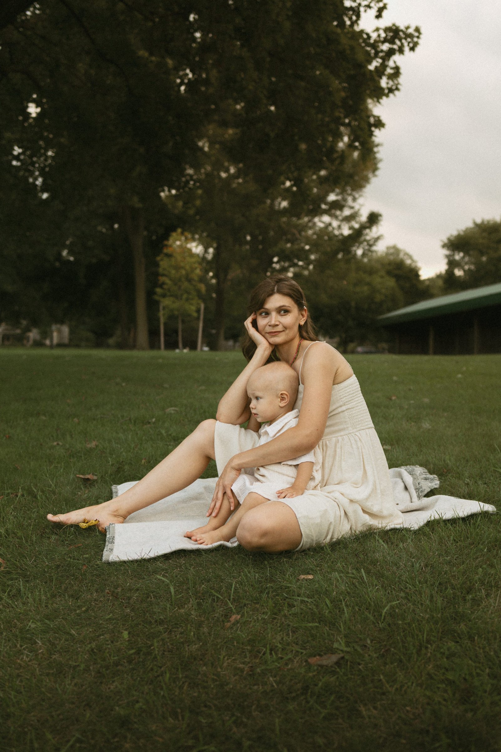
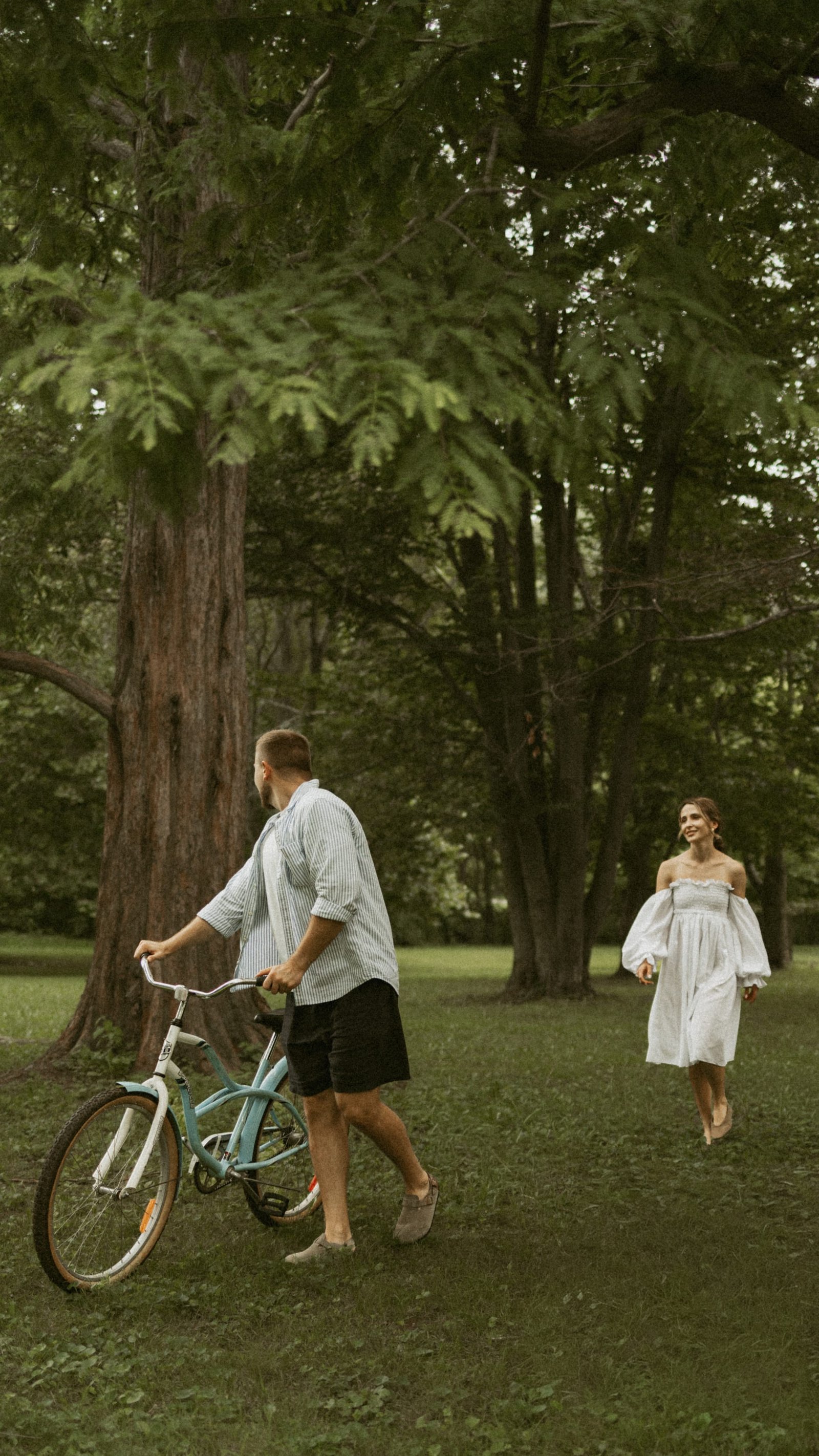
Alina and Timofii in Dickson Park: cream linen on both of them and bare feet. Two people, one palette.
The four rules
1. Take your colours from the location
The easiest palette is the one that's already there. A September meadow is honey, rust and dusty green. A pine forest is deep green and brown. A lakeshore is blue, grey and sand.
Wear colours that sit inside the landscape and the photograph feels whole. Wear colours that fight it (bright red in a green park, royal blue in a wheat field) and the eye goes straight to the clothes.
If we've already picked a location, I'll tell you what it looks like at that time of year. If you haven't, my guide to family photo locations in Kitchener-Waterloo and Cambridge describes what each place feels like.
2. Choose mid-tones over bright white and black
This is the painter's rule people don't expect, and it matters more than any other.
Pure white is the brightest thing in the frame, so it pulls attention and loses its detail first in evening sun. Pure black goes flat and swallows shape. Both look fine in real life and harsh in a photograph.
Mid-tones do the opposite. Cream instead of white. Charcoal, navy or deep brown instead of black. Sage instead of bright green. They hold their detail, they flatter skin, and they let the light do the work.
3. Pick fabric that moves and has texture
Light needs something to hold on to. Linen, cotton gauze, chunky knits, corduroy, a wool coat: they all catch light and throw soft shadows, which is what makes a photograph feel touchable.
Movement matters just as much. A long skirt or dress that swings when you walk, a loose shirt, a scarf. The best frames in a session usually happen mid-step, and fabric that moves makes those frames.
4. Dress Mom first
Plan the mother's outfit first, then build everyone else around it. She's usually in the most frames, holding the children, at the centre of the composition. If her outfit works, the rest follows. If it's an afterthought, it shows.
A dress or skirt that reaches at least mid-calf is the single most useful piece. It gives shape when you're standing, drapes beautifully when you sit in the grass with a child in your lap, and it moves.
What to leave in the closet
- Logos and writing. Anything readable becomes the first thing anyone reads.
- Small, tight patterns. Fine stripes and tiny checks can shimmer strangely on camera. Big, soft florals are fine.
- Neon and very saturated colours. They reflect colour onto faces and skin.
- Matching outfits. Everyone in the same white shirt and jeans looks like a team photo.
- Anything new and untested on the kids. Scratchy tags and stiff shoes ruin a toddler's mood in about four minutes.
- Sunglasses on heads, hair ties on wrists, lanyards, smartwatches. Tiny details, big distractions.
Outfit ideas by season in Ontario
Fall (September to November)
The best season of the year for family photos here, and the easiest to dress for. Borrow from the trees.
Palette: rust, ochre, cream, deep olive, soft denim.
Ideas: a rust or mustard knit on one parent, cream on the other, denim or cord on the kids. A long floral dress with warm tones for Mom. Boots rather than sneakers, because leaves are wet in the evening.
Winter (December to February)
Most of my winter sessions happen indoors in window light, which is soft and quiet, a lot like an old Dutch interior. Outside, snow is a giant white reflector.
Palette: oatmeal, camel, burgundy, forest green, grey.
Ideas: chunky knits, wool coats in camel or grey, a burgundy scarf as the one strong note. Avoid black puffer jackets outdoors; against snow they read as holes in the frame.
Spring (March to May)
Everything is new and pale. The light is cool and clear.
Palette: sage, dusty blue, cream, soft blush.
Ideas: light linen, a cotton dress in dusty blue, cream knit for the kids. Layers, because an Ontario spring evening can drop ten degrees in an hour.
Summer (June to August)
Warm, green and long, with golden hour late in the evening.
Palette: cream, soft yellow, sky blue, terracotta.
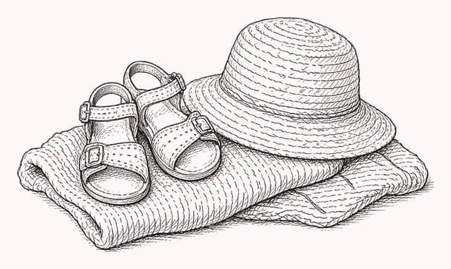
Ideas: linen everything. Bare feet if the grass allows it. A straw hat does a lot of work, especially on a toddler.
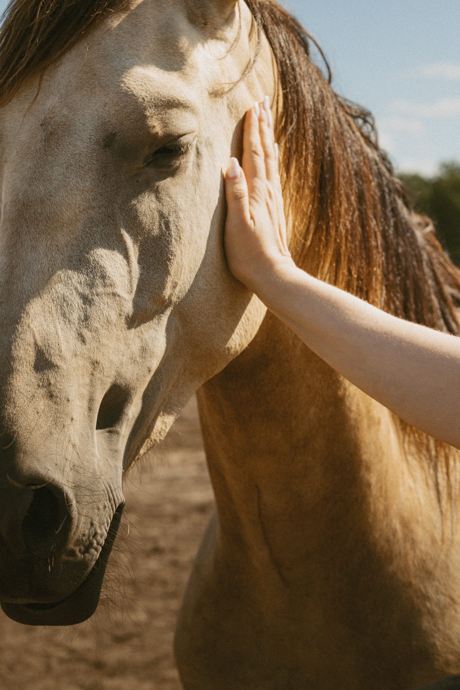
Denim overalls and a sun hat at the horse farm near Waterdown. Simple, durable, and entirely him.
Dressing each person
Babies and toddlers: comfort first. Soft cotton, no tags, nothing tight at the waist. Overalls and rompers photograph beautifully and survive grass. Bring a spare in case of accidents with snacks.
Dads and partners: a plain knit, a soft button-down or a textured tee in one of the palette colours. Rolled sleeves look relaxed. Avoid shiny dress shirts and anything very fitted.
Older kids: let them choose from the palette. A child who likes what they're wearing smiles more.
Maternity: something long and flowing that shows your shape, in a single colour from the palette. Fitted at the bust, loose below. If you'd like the bump visible, a knit dress works beautifully.
Mommy and me: you and your child in the same colour family, not identical clothes. Cream and oat. Sage and cream. Soft blue and white. You want to look connected, not costumed.
A simple way to check your choices
Lay everyone's outfits on the bed, next to each other, and take a photo on your phone. Then turn it black and white.
If one piece jumps out as much brighter or darker than the rest, swap it. If everything sits in a similar middle range, you've got it. Painters do this by squinting. Your phone does it faster.
Frequently asked questions
What colours look best in family photos? Muted mid-tones taken from the location: cream, sage, rust, ochre, dusty blue, denim. They flatter skin and hold detail in evening light.
Should our family match? No. Coordinate within two or three shared colours plus a neutral. Matching outfits look staged.
Is it okay to wear white? Cream or ivory is better than bright white, which is the first thing in the frame to lose detail in sunlight.
What should Mom wear for family photos? A dress or skirt that reaches at least mid-calf, in one of the palette colours, in a fabric that moves. Plan it first and build the family around it.
Can we change outfits? Yes. The two-hour Long Session includes time for an outfit change or a second location.